However, after looking at the fonts remaining, I felt that the last option was best for to portray our artist. The reason being, as it can appear girly but is still bold and clear. The other options, did not look right once downloaded onto our product as it gave a different image to how I felt our artist should be portrayed.
Showing posts with label Digi Pack Planning. Show all posts
Monday, 28 November 2011
Ideal Fonts
I decided to research fonts so that I could use it upon all of our ancillary texts. I felt that the font that was already on photo shop was too basic and didn't portray the artist in the way that I felt was necessary. Therefore, I used the website 'da font' to research all the options available. After searching through all the samples, I was left with five that I felt would be best for the artist or in fact the theme that we had created.
However, after looking at the fonts remaining, I felt that the last option was best for to portray our artist. The reason being, as it can appear girly but is still bold and clear. The other options, did not look right once downloaded onto our product as it gave a different image to how I felt our artist should be portrayed.
Sunday, 6 November 2011
Digi Pack Inlay Ideas
To finalise my digi pack ideas, I have gathered a colletion of props and costume that is needed to build up my photoshoot that is taking place over the next couple of days. To make the evaulation easier and to give a varied artist, I have decided to make the inlay different photos to that on the front and back of the Digipack.
The front and back of the Digipack are still keeping the theme of Alice in Wonderland, where as the inlay designs are different, showing the artist more of herself. The reason for this, is that it creates a more realistic design for digipacks, but also makes the evaulation easier.
The props that I have gathered are:
- Coloured Balloons
The costumes are:
- Denim jacket
- Denim shorts
- Indie vest top
- Bandeau
- Bright wedges
- Knitted cardigan
- Knee high socks
- Coloured headband
My ideas to put everything together is three shoots so that there are three different pages for the inlay with another being a close up of the artist's face.
First shot:
Idea: Amelia standing on a hill or in a field holding bright coloured balloons
Reasoning: Makes the artist appear indie, showing that she is bright and colourful
Props: Bright balloons
Costume: Indie vest top, denim shorts, bare feet
Second shot:
Idea: Sitting or standing on a pavement in a 'city'
Reasoning: Gives the artist an 'edgy' apprearance
Props: N/A
Costume: Leggings or black jeans, bandeau, Bright wedges
Inspired by:
Third shot:
Idea: Close up of Amelia wearing a knitted cardigan
Reasoning: Shows a valuranable side to the artist
Props: N/A
The front and back of the Digipack are still keeping the theme of Alice in Wonderland, where as the inlay designs are different, showing the artist more of herself. The reason for this, is that it creates a more realistic design for digipacks, but also makes the evaulation easier.
The props that I have gathered are:
- Coloured Balloons
The costumes are:
- Denim jacket
- Denim shorts
- Indie vest top
- Bandeau
- Bright wedges
- Knitted cardigan
- Knee high socks
- Coloured headband
My ideas to put everything together is three shoots so that there are three different pages for the inlay with another being a close up of the artist's face.
First shot:
Idea: Amelia standing on a hill or in a field holding bright coloured balloons
Reasoning: Makes the artist appear indie, showing that she is bright and colourful
Props: Bright balloons
Costume: Indie vest top, denim shorts, bare feet
Second shot:
Idea: Sitting or standing on a pavement in a 'city'
Reasoning: Gives the artist an 'edgy' apprearance
Props: N/A
Costume: Leggings or black jeans, bandeau, Bright wedges
Inspired by:
Third shot:
Idea: Close up of Amelia wearing a knitted cardigan
Reasoning: Shows a valuranable side to the artist
Props: N/A
Costume: Knitted cardigan, Knee high socks
Tuesday, 25 October 2011
Inital Ideas For Digipack - Black and white
The ideas that I thought of with using this method are the following:
The scene of cards falling
- The cards fallen on the floor with 'Alice' sitting on top the cards, cross legged.
- Either the cards will be the orginial colour, or Alice's dress will be the original blue
- If the cards are the orginal red, then the angle will be an extreme high angle,
focusing upon the cards.
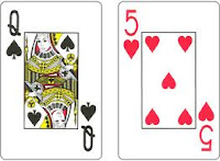
- However, if the dress is the only bright colour, then the camera will just be at a straight angle, directly in front of Alice. OR
- Alice lays down on the fallen cards, again with either the cards in orginial colour
or Alice's dress.
- The camera will then be directly above alice (birds eyed view)
- Therefore the message will then give the impression that Alice is vanurable, and a
sence that she has almost given up
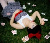
Due to the fact that i haven taken any of the photos for the digipack, I found this image on the internet, which has a simillar effect to how I am creating the front cover of the digi pack. Tea Party
Another idea that I have thought of, continuing from the theme above, however, using the tea party scene but making specific products coloured. The tea party scene, personally, is the favourite scene within filming, due to the fact that it has so many creative aspects. I also feel that it really connects with the original 'Alice and Wonderland', meaning that our music video is clearly related.
The aspect that could be bright rather than black and white, are the tea mugs and jug, or again, Alice's dress. The reason for the mugs and saucers to be left with the orginal colour, is that it allows all the focus on the props rather than the music artist.
The image above, shows an image of the tea party, however, during the filming of our own music video we created our own interpretation.
The aspect that could be bright rather than black and white, are the tea mugs and jug, or again, Alice's dress. The reason for the mugs and saucers to be left with the orginal colour, is that it allows all the focus on the props rather than the music artist.
The image above, shows an image of the tea party, however, during the filming of our own music video we created our own interpretation.
Planning of Digi Pack
After producing a mind map for our digi pack, I have thought of some ideas that could make our artist stand out and become orginial. One of the ideas that i thought of, was having an image taken from the video; however, having the image completly black and white with one aspect in colour. The reasoning for this, is it allows the focus to fall on the part that has the colour worked into the image. Below are examples to explain my idea.
This image focuses on the multi-coloured ballons.
The focus of this image is the flowers held behind the girl's back.
I feel that this method suits the genre that we are working with. Due to the dull colours with a splash of bright colours, drawing attention in creative ways. The message if we used this method for our music video, would be a sense of alone and darkness (due to the dull colours). However, the bright splashes of colour, will associate the artist's personailtly with the song.
Wednesday, 19 October 2011
Planning of Digi Pack
To gather a greater understanding of how the digi pack is going to connect with the filming of the music video, I created a spider diagram of diffferent ideas. In realation to 'Camera, Editing, Mise en scene and Lighting'.
Wednesday, 12 October 2011
Information for Digi Pack
To produce a digi pack there are a few factors that are essential to produce a realistic product. How to create this is to feature some images and icons that could be used for the front or back cover of the digi pack.
The main images that the digi pack should have featured are:

The main images that the digi pack should have featured are:
- Barcode
- Blackberry Code
- Producers company
- Songs titled
- Album name and artist
e.g Rihanna
Subscribe to:
Posts (Atom)