Friday, 9 December 2011
Friday, 2 December 2011
Evaluation
Question One:
Mise en Scene - Location

The other convention that we chose to develop was mise en scene - location. Due to the theme of Alice in Wonderland, which we decided to base our music video on, there was a variety of different locations that was associated with the theme. The reason being as this theme is based upon everything being 'wacky' and 'out of place. Therefore, chosing the location for our tea party, we felt that outside backing onto a row of dark trees would be best for what we were trying to portray. The mise en scene, regarding the props, fitted into the theme and genre perfectly with the top hat, mugs and costume that Alice is wearing.
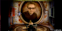
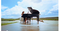
To compare our video along with another, I chose Sarah Bareilles - 'Love Song' due to choice of video. The reason being as her video is filmed so that it looks like she is placed inside a music box playing the piano. I chose this music video as I felt the link with how the footage is filmed is portrayed in such a way to provide a message. With the song choice, the video is filmed in such a way that it plays with the scale (another factor that is featured heavily within Alice in Wonderland) having the singer and instrument scaled down to appear within a music box.
Challenged conventions
Theme
Motif
To challenge a convention, we decided to created a motif (recurring visual theme) as this would ensure that the narrative was consistent for the viewer. We showed the motif through out our video by using scale, making things appear smaller with the use of the camera angle. We decided to use this as we felt that our song was 'dark' and the video portrayed this, therefore we needed a contrast with some aspects that could be appeared to be more of a 'joke'. However, I felt that the motifs that we included in our video should still be kept to our overall theme of the video. With this in mind, during the editing, we still kept the lighting the same compared to the other scenes and the way that it was filmed. Playing on scale, we used a dolls house to create this. Amelia was positioned inside a dolls house with a high camera angle, to make the appearance of her being smaller than she actually is. I gathered inspiration from Jessie J's music video - 'Price Tag'. The reason being, is that during her video, she uses the same motif with playing on scale, making things appear a lot smaller than they actually are. She also has a more light hearted approach with the childlike simillarites. Another reason why we decided to use this artist as an inspiration and the similar characteristics within our video, as I felt that it created a wider audience. This being as it can be aimed more at children with the props included within the video.
Question Two
Question Three
We gathered audience feedback for our video by handing out questionnaires in a sixth form assembly. The reason being as we could then gather feedback from a range of different people with different music tastes. After collecting the questionnaires back, I found that there were many with comments that I found helpful with helpful suggestions. Both negative and positive comments were taken on board. The majority of positive comments consisted of the theme, location and props, where as the negative comments were based around the performance.
Question Four
I felt that media technologies were very helpful through the construction and research, planning and evaluation stages due variety of products that we used. During the construction stages, a HD camera, along with a tripod, came in handy producing constant steady shots and the ability to zoom in and out with out losing the pixels. Another reason why we used a HD camera was if we felt that a shot had the correct composition for an image to use for the ancillary texts, we could take it 'on the spot.' Final cut express was the software that we used to edit our footage into a music video. With this we were able to alter the colour contrast to make it appear darker, fitting within the theme more. Using the MP3 we were able to overlay the song to our footage to lip sinc the video.
In what ways does your media product use, develop or challenge forms and conventions of real media products?
Stayed within convention
Close up
We have used various conventions throughout the planning, researching and creating of our music video. One of the main conventions that we have stuck to is the close/extreme close up's of the artist, due to the fact that it connects the artist to the audience. It does this by allowing the audience to identify themselves with the artist, creating a connection. Sympathy for the way that she is portrayed through the video is created due to her longing of desire and her sense of loneliness in Wonderland. It can also express the lyrics with how the artist feels, by looking directly at the camera with particularly lyrics. Another way that the lyrics can be empathised is the extreme close up's of the artist face in certain parts of the song. The song has an overall feeling of coldness and a sense of alone, this is portrayed through the artists expressions and through her eyes. Her eyes have a glaze over them, showing the coldness, which mimics the lyrics in her actions. I compared our music video with Amy Mcdonald - 'This is the life' due to her continuous close up's and the artist fitting into the indie genre. During the video, Amy's expressions were often made by her eyes, meaning that it was 'cold' and sudden, giving an overall theme of darkness within the video to the audience. In our video, Amelia has similar expressions also. The reason being as our video has the same effect. We used this convention, as I felt that we needed a connection between the audience and the artist. Not only did it build a connection, but it also stayed with in the convention which ultimately made it easier for the audience to gather the overall narrative and the genre which the music video fits in. By keeping to this convention, an overall effect was created which kept the connection between both the audience and the artist. It also showed the artist as herself, rather than the illusion of Alice from Alice in Wonderland (the overall theme of our music video). The close up's meant that the artist's face was framed by the camera, cutting off the mise en scene, costume and props that portrayed wonderland. The angle of the camera was often on the same level as Amelia but off to the side, this gives an overall effect that she is not connecting to the audience in a direct way, she is portraying the narrative of being alone in Wonderland.
Narrative
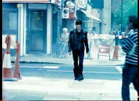
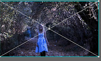
Another convention that we stuck with throughout our music video was narrative. I felt that this was key, due to the song choice and to make it clear to the audience what was happening throughout the video. The overall narrative that we decided upon was the story of Alice in Wonderland, however, we felt that it would be more interesting if we took the overall story and made it our own. We did this, by allowing Alice to be alone in Wonderland. This automatically set tone for our music video which linked to the lyrics and music. I gathered inspiration from the video ‘Bitter sweet sympathy’ – The Verve, due to the continuous narrative through the music video. I decided to use a narrative as it portrayed our ideas through the video in a clear, concise form. I felt that keeping the video clear to understand was key as the narrative in itself could be quite hard to follow, therefore the narrative was important to portraying the overall video. To create this particular narrative, we filmed a long shot of Amelia walking under a corridor of trees. We came up with this idea through the inspiration of the Verve with the similar footage. The actor in the video was walking down a street, automatically this provides the narrative for the audience, however, I felt that we could still create the same affect but with filming the narrative in a different way. I feel that overall it gives an effect that the audience will always remember and associate our video with. It provides an enjoyment for for the audience in an unusual way of creating a mysterious sense.
Developed Conventions
Lighting
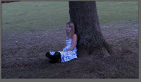
The convention that we developed was the lighting contained within our video. The reason why we developed this convention is to create an overall effect for the video, keeping within the narrative. The theme that we created was a dark and empty Wonderland with only Alice by herself. Therefore, we decided to take up the opportunity of using the lighting to really create the mood for the viewer. With this in mind, we used a wash of blue over certain aspects of footage and lowered the brightness. Whilst researching other music videos and the effects that they used, I looked at the video Miley Cyrus 'When I look at you'. However, with her video, she used colour contraster to edit the lighting to make it look brighter and unrealistic. I took inspiration from this video with how the mood was created here. Even though our colour contrasts are different, with Miley's video being brighter and ours being darker, there is a clear comparison between them both. After showing the video to a wide audience, we got a range of feedback explaining that the lighting was effective as it portrayed the theme in a clear manor.
Close up
We have used various conventions throughout the planning, researching and creating of our music video. One of the main conventions that we have stuck to is the close/extreme close up's of the artist, due to the fact that it connects the artist to the audience. It does this by allowing the audience to identify themselves with the artist, creating a connection. Sympathy for the way that she is portrayed through the video is created due to her longing of desire and her sense of loneliness in Wonderland. It can also express the lyrics with how the artist feels, by looking directly at the camera with particularly lyrics. Another way that the lyrics can be empathised is the extreme close up's of the artist face in certain parts of the song. The song has an overall feeling of coldness and a sense of alone, this is portrayed through the artists expressions and through her eyes. Her eyes have a glaze over them, showing the coldness, which mimics the lyrics in her actions. I compared our music video with Amy Mcdonald - 'This is the life' due to her continuous close up's and the artist fitting into the indie genre. During the video, Amy's expressions were often made by her eyes, meaning that it was 'cold' and sudden, giving an overall theme of darkness within the video to the audience. In our video, Amelia has similar expressions also. The reason being as our video has the same effect. We used this convention, as I felt that we needed a connection between the audience and the artist. Not only did it build a connection, but it also stayed with in the convention which ultimately made it easier for the audience to gather the overall narrative and the genre which the music video fits in. By keeping to this convention, an overall effect was created which kept the connection between both the audience and the artist. It also showed the artist as herself, rather than the illusion of Alice from Alice in Wonderland (the overall theme of our music video). The close up's meant that the artist's face was framed by the camera, cutting off the mise en scene, costume and props that portrayed wonderland. The angle of the camera was often on the same level as Amelia but off to the side, this gives an overall effect that she is not connecting to the audience in a direct way, she is portraying the narrative of being alone in Wonderland.
Narrative


Another convention that we stuck with throughout our music video was narrative. I felt that this was key, due to the song choice and to make it clear to the audience what was happening throughout the video. The overall narrative that we decided upon was the story of Alice in Wonderland, however, we felt that it would be more interesting if we took the overall story and made it our own. We did this, by allowing Alice to be alone in Wonderland. This automatically set tone for our music video which linked to the lyrics and music. I gathered inspiration from the video ‘Bitter sweet sympathy’ – The Verve, due to the continuous narrative through the music video. I decided to use a narrative as it portrayed our ideas through the video in a clear, concise form. I felt that keeping the video clear to understand was key as the narrative in itself could be quite hard to follow, therefore the narrative was important to portraying the overall video. To create this particular narrative, we filmed a long shot of Amelia walking under a corridor of trees. We came up with this idea through the inspiration of the Verve with the similar footage. The actor in the video was walking down a street, automatically this provides the narrative for the audience, however, I felt that we could still create the same affect but with filming the narrative in a different way. I feel that overall it gives an effect that the audience will always remember and associate our video with. It provides an enjoyment for for the audience in an unusual way of creating a mysterious sense.
Developed Conventions
Lighting


The convention that we developed was the lighting contained within our video. The reason why we developed this convention is to create an overall effect for the video, keeping within the narrative. The theme that we created was a dark and empty Wonderland with only Alice by herself. Therefore, we decided to take up the opportunity of using the lighting to really create the mood for the viewer. With this in mind, we used a wash of blue over certain aspects of footage and lowered the brightness. Whilst researching other music videos and the effects that they used, I looked at the video Miley Cyrus 'When I look at you'. However, with her video, she used colour contraster to edit the lighting to make it look brighter and unrealistic. I took inspiration from this video with how the mood was created here. Even though our colour contrasts are different, with Miley's video being brighter and ours being darker, there is a clear comparison between them both. After showing the video to a wide audience, we got a range of feedback explaining that the lighting was effective as it portrayed the theme in a clear manor.
Mise en Scene - Location


The other convention that we chose to develop was mise en scene - location. Due to the theme of Alice in Wonderland, which we decided to base our music video on, there was a variety of different locations that was associated with the theme. The reason being as this theme is based upon everything being 'wacky' and 'out of place. Therefore, chosing the location for our tea party, we felt that outside backing onto a row of dark trees would be best for what we were trying to portray. The mise en scene, regarding the props, fitted into the theme and genre perfectly with the top hat, mugs and costume that Alice is wearing.
To compare our video along with another, I chose Sarah Bareilles - 'Love Song' due to choice of video. The reason being as her video is filmed so that it looks like she is placed inside a music box playing the piano. I chose this music video as I felt the link with how the footage is filmed is portrayed in such a way to provide a message. With the song choice, the video is filmed in such a way that it plays with the scale (another factor that is featured heavily within Alice in Wonderland) having the singer and instrument scaled down to appear within a music box.
Challenged conventions


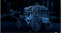
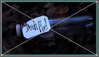
One of the conventions that we challenged was in fact the theme chosen for our music video. After listening to the song, we felt that it should in fact have a fairy tale narrative due to the lyrics. However, the song had a slower rhythm, therefore the narrative could not be a child like fairy tale, it had to appear darker. With this in mind, we came up with Alice in Wonderland. The reason being, is that there could be many interpretations of how to take the original fairy tale and turn it into something your own. Another video that also uses the convention of theme with using a fairy tale as well was Payton Rae - 'Not your Cinderella'. With the song title, it instantly provides connotations of a fairytale, therefore, I felt that our own music video could relate to ours. Payton Rae's video was based upon the original story of Cinderella, using all the icons, including the carriage and glass slipper. In our music video, we used the glass bottle that is associated with Alice in Wonderland saying 'Drink me'. With this prop, I felt that it showed instantly to the audience what we were trying to portray within our video.
Motif
To challenge a convention, we decided to created a motif (recurring visual theme) as this would ensure that the narrative was consistent for the viewer. We showed the motif through out our video by using scale, making things appear smaller with the use of the camera angle. We decided to use this as we felt that our song was 'dark' and the video portrayed this, therefore we needed a contrast with some aspects that could be appeared to be more of a 'joke'. However, I felt that the motifs that we included in our video should still be kept to our overall theme of the video. With this in mind, during the editing, we still kept the lighting the same compared to the other scenes and the way that it was filmed. Playing on scale, we used a dolls house to create this. Amelia was positioned inside a dolls house with a high camera angle, to make the appearance of her being smaller than she actually is. I gathered inspiration from Jessie J's music video - 'Price Tag'. The reason being, is that during her video, she uses the same motif with playing on scale, making things appear a lot smaller than they actually are. She also has a more light hearted approach with the childlike simillarites. Another reason why we decided to use this artist as an inspiration and the similar characteristics within our video, as I felt that it created a wider audience. This being as it can be aimed more at children with the props included within the video.
Question Two
How effective is the combination of your main product and ancillary texts?
Question Three
What have you learned from your audience feedback?
We gathered audience feedback for our video by handing out questionnaires in a sixth form assembly. The reason being as we could then gather feedback from a range of different people with different music tastes. After collecting the questionnaires back, I found that there were many with comments that I found helpful with helpful suggestions. Both negative and positive comments were taken on board. The majority of positive comments consisted of the theme, location and props, where as the negative comments were based around the performance.
Question Four
How did you use media technologies in the construction and research, planning and evaluation stages?
During the research and planning stages, I used particular online applications to help me gather a greater understanding for the genre and the certain elements that are required to produce a authentic video. These applications consisted of: Facebook - to keep updated with other members of my group and actress as well as getting audience feedback; Blogger - to keep all my coursework on a website that would organise all my important information and Prezi - Endless whiteboard to note our spider diagrams on, just to name a few. I felt that all these online applications were a great help to organising my research and planning.
For my evaluation, again I used the same online applications as the research and planning for the same uses too. The reason being as it keeps all my important information up to date and organised. To gather audience feedback, a questionnaire was handed into other members of our school to collect their important comments and suggestions. Overall, I felt that all the media technologies worked well with all the elements that was required to plan and create a music video.
Monday, 28 November 2011
Digi Pack Tutorial
During creating the digipack front cover, I felt that using a black and white image would be better for the overall effect that I wanted to portray. The reason being as I wanted the front cover to show the artist as 'herself' rather than being portrayed within the theme of 'Alice in Wonderland.' A black and white image complimented the artist with the tones and warmth to the image.
I decided to watch youtube tutorials of how to create the editing required for the image. With this in mind, I then learnt the basics and applied them to the photo that I had previously took. I up loaded the image onto photo shop and performed the task into making the overall image black and white.
The tutorial that I used is below:
Ideal Fonts
I decided to research fonts so that I could use it upon all of our ancillary texts. I felt that the font that was already on photo shop was too basic and didn't portray the artist in the way that I felt was necessary. Therefore, I used the website 'da font' to research all the options available. After searching through all the samples, I was left with five that I felt would be best for the artist or in fact the theme that we had created.
However, after looking at the fonts remaining, I felt that the last option was best for to portray our artist. The reason being, as it can appear girly but is still bold and clear. The other options, did not look right once downloaded onto our product as it gave a different image to how I felt our artist should be portrayed.
However, after looking at the fonts remaining, I felt that the last option was best for to portray our artist. The reason being, as it can appear girly but is still bold and clear. The other options, did not look right once downloaded onto our product as it gave a different image to how I felt our artist should be portrayed.
Last Filming Session
Due to completing our music video, the master shot still needed to be filmed. This shot will be used to fill the gap of the chorus, however using a variety of different shots to make our video more interesting. Originally, we decided that we would film the footage in the main school hall, to provide a long sheltered walkway for Amelia to walk down with cards falling over her. Eventually, sitting down on scattered cards to place the top hat on her head. However, when it came down to filming, the hall was in use for exams and Christmas fare, which meant that we could not use the hall at all, even though we had booked it previous. In need of filming, I felt that we didn't have time to wait for after the weekend and the school play rehearsals, so I decided to look else where.
Eventually, I decided to film in the courtyard with the roses. I felt that this had connotations and similarities to the original Alice in Wonderland. Using the large cards that I used for the digipack photo shot, I felt that this would provide a more 'fairytale' like surrounding if we scattered the cards in the bushes and along the walk ways. Due to filming after school, the light had got dim which gave the surroundings a naturally darker light (which is perfect for our theme of the video) but with the side lights, lighting up the area. The brick work with the rose bushes created a more realistic appearance for our narrative music video.
I varied the shots and angles to make the footage more interesting, so that once it was edited it would create a less boring video for the audience. I feel that overall, the footage that was filmed was a success, with the angles and shots making it more interesting for the viewer.
Wednesday, 23 November 2011
Audience Feedback
To gather audience feedback, our videos were shown in assembly so that we could collect a wide range of feedback from people with all types of music preferences. Prior to assembly, we created a questionnaire for everyone to answer so that there were specific questions for everyone to answer. Deciding on four questions that cover all aspects of the video, included genre, authenticity, how effect the video was and criticisms. However, when the assembly was held, our video was not yet completed which meant that there were gaps during the chorus. This meant that our master shot had not being edited into the video at this stage.
After looking back at the sheets with the feedback there was a variety of different comments, most helpful, however some were just simple which gave no context within the feedback. I created a mind map titled with the main points to section off all the helpful comments. This is ultimately be incredibly useful when completing the evaluation placing the comments upon our video when on youtube. The comments that I felt were helpful were mostly positive, however the more negative criticism are wrote in blue on the mind map. Most of the hand outs came back with similar comments of what could be done better or what we have done well in.

Thursday, 17 November 2011
Audience Feedback Questions - For Assembly
To gather a mass feedback for our video, we were given the opportunity to show our video during assembly. The reason for this, is it provides a large audience with people of different ages and music types.
The questions that we are going to ask are:
1) Do you feel that our music video fits into the genre? (indie/pop) Why?
2) Does our music video look authentic? Why?
3) What aspects of the video do you find effective?
4) Any criticism that you feel we could benefit from?
From this, we will hopefully get some beneficial responses from the audience. The questions that we have asked has covered the main aspects of what we can learn from.
Magazine Advert Research
To create our magazine advert for our digipack, we researched a similar artist compared to that of our own. Therefore, we used Laura Marling, however her promotion for her singles rather than her album.
Tuesday, 15 November 2011
Last Filming Session
To create our master shot, I decided to end the filming so that we can concentrate on the editing of our music video. I gathered large playing cards (that I used for the photoshot) and positioned then around the courtyard. I chose this area as I felt it copied the origianal Alice in Wonderland, however with our own twist.
I filmed after school so that the lighting was darker but with the lights, giving a glow on camera. This meant that the lighting was complimentary to Amelia and on camera. I used a variation of shots and angles, which meant that the master shot had different aspects of the same shot. It meant that when the audience had different shots to look at.
I created a narrative approach to filming, due to the fact that it was the master shot which carried the main narrative. Amelia (Alice) is holding a book which is a link to the original Alice in Wonderland. She carries it through the courtyard which is scattered with large cards where she walks to a bench and sits down with the book beside her.
Overall, I feel that this filming session was a success due to the shots and lighting that was created on camera. However, after the filming session, I felt that it could have gone better, although looking back at the footage, the footage that I gathered, works well for the master shot.
Research for magazine album adverts
To gather information to create a realistic magazine advert, I decided to research other magazine adverts and see what the conventions are. Therefore, I will be able to compare both adverts with their albums and see what they all have in common.
'The Vines'
Magazine Advert:
Album Cover:
'Noah and The Whale'
Magazine Advert:
Album Cover:
'The Vines'
Magazine Advert:
Album Cover:
'Noah and The Whale'
Magazine Advert:
Album Cover:
- After analysing both the products, I have found that they in fact have many things in common:
- Capital letters for the artist - To allow focus to fall on the important information
- Release date - Very key as this is showing the audience when to buy the album
- The albums and magazine adverts have the same styling and images - This is to connect both the products together
- Some of the singles that are included in the album are listed on the advert - This is to show people what is included, so if they like the singles, they are more likely going to buy the album
- Reviews are also included with in the poster - Again to show the audience positive feed back and why they should buy the album
- The fonts are very complimentary to the album and magazine advert
Thursday, 10 November 2011
Magazine Advert for Album
During our editing day, I created the magazine advert to contribute to our overall product. I researced the different conventions for what is required for an advert for this industry. I found that there is a huge focus apon the connections between both the album and the advert. The reason for this, is that the public can make an immediate connection with both products.
I researched different fonts to see which one was suitable for the artist and what image she would like to portray. After looking through photoshop font's, I found that there was none that would in fact suit the artist with a close connection. I therefore, downloaded a varitey of fonts off a website - 'da font' to experiment with how it appeared on the magazine and album. Both products needed to be connected with one another, therefore, the font is needed to be used in both, to give the automatic connection. I finally went for the font 'ElegantLight', due to the fact that its bold but simple. This gives the imperssion of the artist being outstanding and bold with a hint of being serious about her carrer. With both the titles, I decided to use capital letters making the lettering stand out for the most important sections within the advert.
I used the main image for the middle that is in the digipack as an inlay. The reason for this, is that both products have to be connected with aspects that are similar or used in both. I took the image of our actress in a corridor of trees, I used this area as it was also used during the filming of one of our scenes in the music video. I gave Amelia this top to wear during this particular photoshot as I felt it relates to university with the wording and bright/bold colours. In this photo, Amelia is barefoot to push the conventions of this genre. It allows a connection between the image and album name, due to the lack of footwear in an outdoor and rural destination. The flowered headband that Amelia is wearing contracts with the autumn surrounding but still maintains the indie genre; once again, linking to the album name 'Misplaced.' I added the ballons into the image as an outspoken focus point, with summer colours clashing with the seasonal background these objects identify the individual theme.
To connect both the products together, I used the image of the front cover of the album on the poster, the reason for this, is to allow the audience to immediatly associate the digipack and poster together. With the front cover the album being black and white, I feel that it works well with the black background, giving a connection between both products. It makes the album standout showing the main product. The font that is contained on the digipack is the same that is used on the poster, again linking both together.
Underneath the photo of balloons, there is key information that tells the audience about the album, for example the release date, where to buy the product and where to find the information of the artist. The realease date is in larger font compared to the rest as this is the most vital information of where to buy the product. Underneath the release date there is the key information of the featured aspects within the digipack. This is important as this is the main reason why the public chose to buy digipacks over singles. I also included the twitter adress, the reason for this, is that twitter is an up coming way of commucating, allowing the artist to be aware of her surroundings.
Down the side of the poster, I have included album reviews of 'Misplaced', as it gives positive persuasion techniques to the audience for why people should buy the album. I have used two reviews and where they have come from, this shows the audience that the quotes have came from well known areas for industry, for example NME.
At the bottom of the poster, there are logos of companies of where to buy the album and find information about the album. Due to the fact that the logos are visual, it prodives an instant link to the important places. The logos are Amazon and HMV.
Potential Backcover
When taking the photographs for the inlay of our digipack, I decided to take a varitey of different shots to show the different connotations of the artist and how she would like to portray herself throughout the album. The reason for this, is due to the fact that the footage is based on the theme of Alice in Wonderland rather than the artist herself. With this photoshot, I have based the images on the appearance of 'attitude' and a sense of boldness.
This photograph is from the same photoshot as the back cover of my digipack, having the same meanings and connotations. However, I felt that this really showed the natural artist having 'fun' due to the pose that the artist is pulling. The reason for why I didn't chose this image, is due to the fact that the quality is not to the standard of the others. Amelia's arm is blurry due to the movement at this partiucallar time. The tilting of the head provides an angle that is very flattering and girly for the artist. With this in mind, the meanings wouldn't have matched the surroundings of the photograph. The reason for this, is the fact that Amelia looks girly and fun, where as the background provides more attitude with the plain black background with graffeti.
Overall, I couldn't use this image for our digipack as the quality of the image was not to the standard of all the other images, therefore providing a lower advantage. However, I felt that if Amelia's arm was not, in fact, blurry, then this could potentially have made the back cover of our digipack.
Potential Inlay
Whilest taking all the photographs for our digipack, I decided upon different shots that would give different connotations and impressions of the upcoming artist. The reason why I decided upon this, is I felt that the video that we filmed did not give enough information as an artist to the audience, therefore I expressed it throughout the digipack.
Rihanna's digipack inspired me with this photoshot as I felt that all the right compositions and connations was shown through this image. I asked amelia to wear a big knitted cardigan with knee high socks to show sex appeal but yet a sense of belonging, due to the cardigan. The image is quite girly due to the clothing and the posture of Amelia. The purity of the cardigan, being white, contrasting agasint the black knee high socks shows the different sides of the artist.
The sightlines of Amelia is directed at the camera however with a slight angle. I feel that this provides a direct connection between the artist and the audience. The arm resting on the far knee shows that she is open. The photograph is taken at the back seat of my car, due to the leather seats and a sense of the surroundings being 'cosy.' However, due to the pick of background, it does give off other connotations of sex appeal.
During the editing stage, I needed to crop the overall image to make it into the correct size to produce a digipack. However, I had problems with this as it cropped the image in a way that I felt didn't look right. To make the photograph appear more intresting, I used yellow tints along with the black and white. However, I felt that this image does not provide the right connotations that I felt the artist needed. With this in mind, I decided to leave this image out of the digipack as it would only lower the standards of ther overall album and other photos.
Back Cover for Album
To create the back cover for our digipack, I took a variety of photos which I could later decide on what would best to give the right impression for the album. For this photo, I deicded to use a plain background, a wooden shed painted black with grafetti. The reason for this, is that allows the artist to be portrayed with an 'attitude', giving a different side to the artist; for example the purity on the front cover.
With the artist wearing all black, again provides the connotations of how the artist is protraying herself compared to the other images included in the digipack. However, the top that Amelia is wearing allows a sense of sex appeal due to the fact that she is wearing a beandeau, only covering the chest. However, with the overlay top, it can still be aimed at younger audiences with connection to her music. The bright colour heeled wedges allows a sense of fun and boldness to the image due to the colour contrasting with the overall image of the photo. Along with the statement peice, it also conatates a 'girly' image to the backcover of the digipack.
The makeup that is worn during the shot, is dark smoky eyemake with pink lips. This follows the indie genre and the overall image of this photo as its dark and mysterious, in particualar with the eye makeup. However, the pink lips contrasts as it shows, again, a more girly side to the artist.
Connecting all the products together, the font is remained the same. 'Audrianna Cole' is written at the top of the album as its the main focus of the back cover. Keeping the font big and bold, it allows all the attention to land on the key information that is remained on the back cover. The song titles are written down the side of the album, keeping to the conventions of every back cover of abums. I have kept the font small due to the fact that it needed to be a certain size to fit all the important aspects of a digipack on the back cover.
I chose the song titles due to different aspects contained throughout the digipack. The reason for this, is that it allows strong connections between the album and the music, however, I did use some of the original song titles from the artist singles. I asked the other memebers of the group for their ideas with different, inventive names to suit the artist. I took inspiration from the theme of our music video - 'Alice in Wonderland.'
To follow the conventions of an album, key information is vital to any back cover. The reason for this, is to allow the legal information to be visiable for the audience. However, this text is usually at the bottom in small font, not to take up too much space but still visiable. With this in mind, I have followed the conventions completly without pushing the boundaries which meant that I positioned the text for copyrighting at the bottom corner of my digi pack in small font.
Inserting images at the base of the image along with the copyright information. Again, I have followed the conventions for music albums to give our digipack a more realistic appearance. I added a barcode in the lowest part of the album, in the corner to draw attention to the image. Above the code, I used a logo for 'DVD' due to the fact that many digipacks link their album with a dvd for their fans. Contained on this dvd is usually 'behind the scenes' or videos from tours. Above both images, there is a blackberry code. The reason for a bb code to be positioned on the back, is that this way of commucating and finding out key information is an up coming technogology that has so far, proved very popular.

Alice and Wonderland Inlay
For our digipack inlay, I decided to keep the theme of the video to continue throughout the inlays of the album. Where as the front/back cover and first inlay will be a more natural, realistic images of the artist. This allows the audience to see the artist as her self rather than a 'fantisy' approach.
I felt that the dress and makeup that Amelia had worn throughout the video should be contiuned through the photos. Like all of our other products that I created, I felt there should be a constant link between all as it gives an automatic connection to the audience. The blue and white stripy dress gives connotations of the constant theme of Alice and Wonderland. The locket that is worn around Amelia's neck implies that there are secrets that are held inside the actress or that is alone. With this connotation, it relates back our impression during the footage of the video with Amelia being alone in Wonderland. The red lipstick is a contrast between the purity of Alice with how the actress is playing her in this version. Red lips is often associated with sex appeal and maturity. This contrasts with the original Alice in Wonderland, which is how everyone thinks of the fairytale. The connations of Amelia's lips being slightly parted as a sign of sex appeal and the connection between singing.
I decided upon large cards for Amelia to lay on as this gave the connotations of Alice being small in wonderland. The cards that had most importance for our footage was the king, queen and ace. However, the key card is in fact the joker. The reason why I chose this card is that I felt gives the oppersit approach to the orignal cards.
Kneeling on Cards - Inlay
For the other inlay for our digipack, I kept in theme with 'Alice in Wonderland' using cards to associate the links between the all the other products. This is to allow an automatic connection between the products for the audience.
I took this photograph during the photo shoot for the inlay to keep to the 'Alice in Wonderland' theme. I used large cards to give the illusion of Amelia being in a small place. The reason for this, as I felt that it fitted into the theme well. I layed the cards on the floor and asked Amelia to kneel on top of them for a number of reasons. First, it fits in well with the theme and the other is that it is a flattering pose of the actress. With the height that is used, due to kneeling, the dress can be spread around her to show of the colours compared to the dull wash of background colour.
Overall, I feel that this photo has kept well inside the theme that we have based all our products upon. I feel that the idea of the large cards works well to give the hidden illustion.
Inlay for CD - Cards
This photo provides another inlay for the digipack, however, this image is positioned in the middle of the album to allow the CD Disk to sit on top of the photo. I chose the image of the photograph to continue the theme throughout the inlay of the digipack and footage.
I took this image of the cards on a black screen to provide a plain background to lay the cards upon. With the plain colours in the surroundings, it allows the focus to fully remain on the cards that are the key aspect connecting the products together. I positioned the joker on top of the deck, again to allow focus to fall on this card. The reason for doing so, gives a contrast between the orginal cards used in 'Alice in Wonderland' compared to our take of the fairytale.
I edited the cards to give a blue tint to the cards and the background. However, still remaining the focus to fall fully on the cards. Overall, I feel that this photograph could be considered as 'boring' due to the lack of things going on, however, I feel that it provides the perfect inlay for the disk.
Middle Balloon Inlay
For the first section of the inlay, when you open the digipack, I decided to go with the more natural photographs as it showed to the audience what the artist is really like. However, for this section of the inlay, I decided to use a photograph which portrayed the indie genre in full. Also, to link the magazine advert with this product through the use of a photograph; therefore showing the audience that there is an automatic connection between both.
I decided to dedicate this section of the inlay to the message from the artist. Due to the fact that this product is a digipack, there are often aspects that are only found in this product, so that the sales increase. Therefore, with this in mind, I have wrote a thankyou message to the fans and everyone that has helped her.
I feel that this photograph and editing really shows the conventions of the indie genre and how all the products relate to each other.
Front Cover
For the front cover of the digipack, I decided to use one of the photographs that I took during the photoshot. I used this image as the front cover, as I felt that it really showed the artist in a more natural form compared to the 'Alice in Wonderland' shot for the inlay. The importance for a front cover is to allow the artist to be protrayed in a way that is going to show throughout their music, attitude and the way they dress.
Orignally I took the image, so that half her face was shown rather than the cropped version, that is seen now as the album. I decided to use half her face as I felt that it really focused upon the artist and the features, like the eyes and lips. However, once I had taken all the photos and chose which one was best to use for the album, I then cropped the image to fit the size of a digipack. This meant that I had to crop half Amelia's face to fit the image on to the album. However, after cropping the photo, I preferred the final image to use for the front cover. This is due to the fact that the focus is upon her eyes.
I editied the photograph into black and white to show the purity and elegance of the artist. For this image, I felt that the front cover should portray the artist in a very natural way, so that the audience could take their own perceptions of the artist. Another reason why I decided to edit the image into black and white due to the font that is used.
To keep all the products the same, I have kept the font the same to link everything together. The name of the album is based upon the song title and the artist name, I have kept the same as the actual artist. Overall, I feel that the front cover for the album gives the righrt connotations of the artist.

Monday, 7 November 2011
Analysis of a Music Video - Genre
I analysed a music video that fitted into the genre conventions due to gathering a greater understanding. The reasoning for this, is to base our own music video with all the different conventions for this genre.
Sound:
This song has a slow beat with strong sounds of instruments. In comparison to the artist that we chose the song to create a video to, for coursework, it also has a slow beat with heavy instruments creating the beat. Katie Tunstall fits into the genre of indie, due to the lyrics and beats of the music, however, not being what most people associate indie music with, I feel that both songs fit well together.
Editing:
In this music video, it heavily relies on editing showing the 'two sides' of the story. The male and female sides. This gives the viewer a different aspect of a music video. Comparing this music video with Audrianna Cole's, the editing has a wider techniques that is needed. 'Misplaced' is a narrative story line, therefore need more 'behind the scenes' editing, with the changing of scenes and shots. Where as "Other Side Of The World" can be seen visually throughout the video.
Mise en Scene:
During this video, the mise en scene is used in 'every day life' where as in Audrianna Cole's video the props that are used are very fairy-tale, following the narrative. The clothing again, during 'Misplaced' is very magical, following the story line, where as the video above is just casual clothing.
I chose the artist Katie Tunstall - "Other Side Of The World." I felt that this song had more similarities with our chosen song, therefore allowing a wider range of analysis.
Sound:
This song has a slow beat with strong sounds of instruments. In comparison to the artist that we chose the song to create a video to, for coursework, it also has a slow beat with heavy instruments creating the beat. Katie Tunstall fits into the genre of indie, due to the lyrics and beats of the music, however, not being what most people associate indie music with, I feel that both songs fit well together.
Editing:
In this music video, it heavily relies on editing showing the 'two sides' of the story. The male and female sides. This gives the viewer a different aspect of a music video. Comparing this music video with Audrianna Cole's, the editing has a wider techniques that is needed. 'Misplaced' is a narrative story line, therefore need more 'behind the scenes' editing, with the changing of scenes and shots. Where as "Other Side Of The World" can be seen visually throughout the video.
Mise en Scene:
During this video, the mise en scene is used in 'every day life' where as in Audrianna Cole's video the props that are used are very fairy-tale, following the narrative. The clothing again, during 'Misplaced' is very magical, following the story line, where as the video above is just casual clothing.
Sunday, 6 November 2011
Digi Pack Inlay Ideas
To finalise my digi pack ideas, I have gathered a colletion of props and costume that is needed to build up my photoshoot that is taking place over the next couple of days. To make the evaulation easier and to give a varied artist, I have decided to make the inlay different photos to that on the front and back of the Digipack.
The front and back of the Digipack are still keeping the theme of Alice in Wonderland, where as the inlay designs are different, showing the artist more of herself. The reason for this, is that it creates a more realistic design for digipacks, but also makes the evaulation easier.
The props that I have gathered are:
- Coloured Balloons
The costumes are:
- Denim jacket
- Denim shorts
- Indie vest top
- Bandeau
- Bright wedges
- Knitted cardigan
- Knee high socks
- Coloured headband
My ideas to put everything together is three shoots so that there are three different pages for the inlay with another being a close up of the artist's face.
First shot:
Idea: Amelia standing on a hill or in a field holding bright coloured balloons
Reasoning: Makes the artist appear indie, showing that she is bright and colourful
Props: Bright balloons
Costume: Indie vest top, denim shorts, bare feet
Second shot:
Idea: Sitting or standing on a pavement in a 'city'
Reasoning: Gives the artist an 'edgy' apprearance
Props: N/A
Costume: Leggings or black jeans, bandeau, Bright wedges
Inspired by:
Third shot:
Idea: Close up of Amelia wearing a knitted cardigan
Reasoning: Shows a valuranable side to the artist
Props: N/A
Costume: Knitted cardigan, Knee high socks
Subscribe to:
Posts (Atom)


 i
i


